
One of the most surefire ways to kill your email marketing campaign is to assume the recipients know what you are offering. Veteran marketers know that without a clear call to action, your email campaigns are as good as dead. Rather than leave readers guessing what to do next, a good CTA guides them through the next course of action.
A good CTA button directs users toward your desired actions through clear and powerful words. The goal could be to get readers to sign up for your newsletters, persuade them to visit your online store, collect customer feedback, and more.
In this article, we discuss the importance of email CTAs, explain their key features, and share a few call-to-action examples to help you write powerful ones and attract the target audience more efficiently.
What is a Call-to-action Email, and Why is It Important?
Email CTAs are messages that persuade viewers to take your desired action. Call-to-action buttons contain a link that takes viewers to a page to complete that action. A strong CTA uses concise language, action words, and bold design elements to grab the reader’s attention.
Calls to action are crucial for email marketing campaigns, as they persuade readers to take action immediately. The truth is that attention is fickle. Therefore, email marketers try to capitalize on every opportunity. In fact, CTA email is the most effective way to influence readers to take action.
How Does a CTA Email Work?
Marketing emails only work when readers take the desired action. A CTA button is a specialized tool that does just that. They are strategically placed within the email message, directing readers toward the marketer’s desired action.
For example, say your email marketing goal is to drive sales. How do you get readers to take action? Typical email marketing campaigns leverage email body copy to describe the product and highlight its benefits. You can also use customer feedback to build trust. However, without a clear direction of what to do with the information, the readers are left stranded.
By simply letting people know what to do next, you can dramatically increase the chances of generating action. Adding a button like “Order Now”, “Get 20% Off”, or “Yes, I Want One” will drive viewers toward your desired action.
Types of Call-to-action Emails
Every email marketing campaign needs a primary goal. But what if there are multiple objectives? In that case, you can include multiple calls to action in decreasing order of priority. Let’s walk through the details:
Primary CTAs

Your primary CTA is the main action you want readers to take. It must be prominently displayed to avoid confusion and conflict with your secondary objectives. In this example from Skype, the primary CTA “Download Skype” is highlighted in the brand’s color. Here are a few ways to help your primary CTA stand out:
- Style it like a button
- Use a different color to highlight the button than the rest of the message
- Implement a bigger font, bold the text, and increase the button size
- Take advantage of white space to distinguish the CTA from the email body copy
Secondary CTAs

You can add all secondary information, like links to a landing page with secondary CTAs. Style these in a less dormant fashion to prevent them from hogging the limelight. In this example from DeskTime, you get brownie points for guessing the primary CTA correctly.
Crucial Features of a Great Call-to-action Email
A good call to action consists of several elements. Here are their five most essential features:
Action-oriented
As the name suggests, a call-to-action button must drive an action. The best CTAs include a verb directing readers toward a specific action. The most popular CTA action words include buy, read, discover, get, and download. These words describe exactly what the reader can expect by clicking on the CTA button.
Short
A CTA email must be short enough to describe the intent. Whether you want people to subscribe to your newsletters, buy your products, or engage with your brand, this is the place for it. You can outline the offer in the email subject line and provide details in the body copy. But restrict the CTA to as few words as possible to make it more eye-catching.
Precise
A good CTA text is to the point and makes sense without blabbering. For example. If you want to convince viewers to subscribe to your newsletters, a good CTA would be “Click here to subscribe”. This tells the viewer exactly what to do, reducing confusion.
Distinct
A powerful CTA should stand out from the rest of the text. The most effective way to create eye-catching buttons is to leave white space around them and highlight the CTA using bold colors. You should also think long and hard before finalizing the call-to-action copy.
Compelling
A good call-to-action copy is supposed to be compelling without going overboard. It needs to evoke an emotional response, create a sense of urgency, appeal to the reader’s self-interest, or focus on the benefits. For instance, say you are promoting a giveaway in your email campaign. Here are two email CTA examples: “Win a Gift” and “Participate in a Giveaway”. Which one do you think is more compelling?
What Makes a Call to Action Stand Out?
As we mentioned earlier, a compelling call to action must capture the reader’s attention and influence them. However, since there is a dearth of space, you must make the most impact with a few words. Powerful action words that drive desire work best. Choose compelling statements that speak directly to the reader, much like a one-on-one conversation. Here are a few tips to help your own CTAs stand out:
Place CTA Buttons Strategically
Your CTA buttons must be easy to find. Hence, you must place them within the viewer’s reach, preferably above the fold. It is best to go with the natural flow of the content. For example, if you are offering a discount in your email campaigns, the CTA should naturally come right after the offer, allowing the reader to claim the offer without getting distracted.
Write Simple Sentences
A strong CTA conveys the message in the first person. For example, instead of writing “Claim Your Free Template,” consider writing “Claim My Free Template.” Furthermore, the CTA should be easy to understand. Avoid using difficult words and complex sentences.
Use Contrasting Colors
Bold colors help the CTA stand out from the rest of the message. While there is no specific palette, bright colors like red, blue, green, yellow, orange, and purple can help distinguish the CTA from the body copy. You can also use your brand colors to highlight the call-to-action buttons.
Create Urgency
We instinctively give greater importance to things that are unobtainable. Marketers utilize this basic psychology trick to create effective email marketing campaigns. You can also add a time limit or highlight the rarity of your product to boost the sense of urgency.
Tug at the Reader’s Heartstrings
Most purchasing decisions are impromptu. Therefore, you must appeal to the buyer’s emotions to make a sale. Compelling CTAs are more effective in increasing click-through rates. So, find out what the reader desires most and sell that idea in your CTA.
Effective Call-to-action Email Examples
Here are the five best email CTA examples by real brands to inspire you to design a compelling call to action for your next campaign:
Urgency CTA
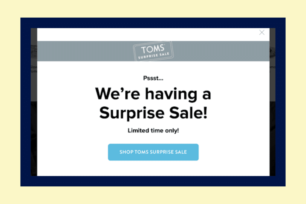
A CTA email promoting urgency can work wonders for driving up sales figures. They invoke FOMO, which influences buyers to make decisions instantly. This call to action from TOMS emphasizes the limited-time deal, while the button in blue stands out from the rest of the design.
Exclusivity CTA

This is one of our favorite CTA emails promoting exclusivity. To’ak and Rob Report highlights the exclusivity of their special edition chocolate-tasting kit. The body copy precisely describes the offer’s USP, while the CTA button sells its exclusivity and the messages combine to promote urgency.
Mystery CTA
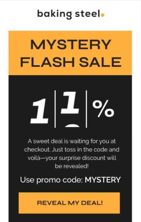
You can leverage the sense of mystery to grab the reader’s attention. Baking Steel’s smooth CTA email is the perfect example. The bold headline and the button are eye-catching, while the body copy explains the nuances of the offer. The message builds anticipation and thrill, motivating readers to click or tap on the CTA button.
Promotional CTA
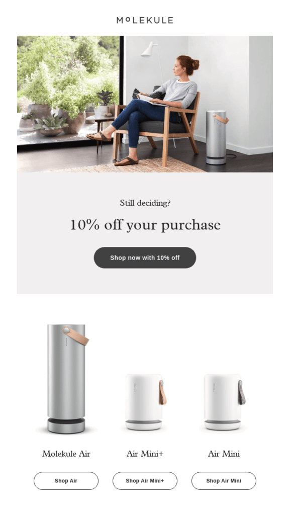
Promotional CTAs are quite effective in grabbing the readers’ attention. This example from Molekule draws focus on the 10% discount offer. Did you notice the offer “10% off” has been mentioned twice above the fold? The elegant design, sufficient white space, and bold CTA button encourage viewers to take action.
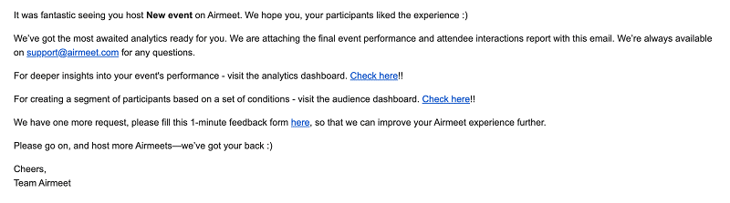
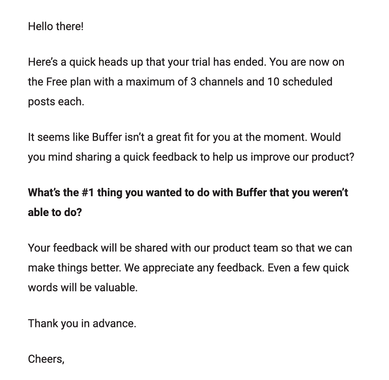
Feedback CTA
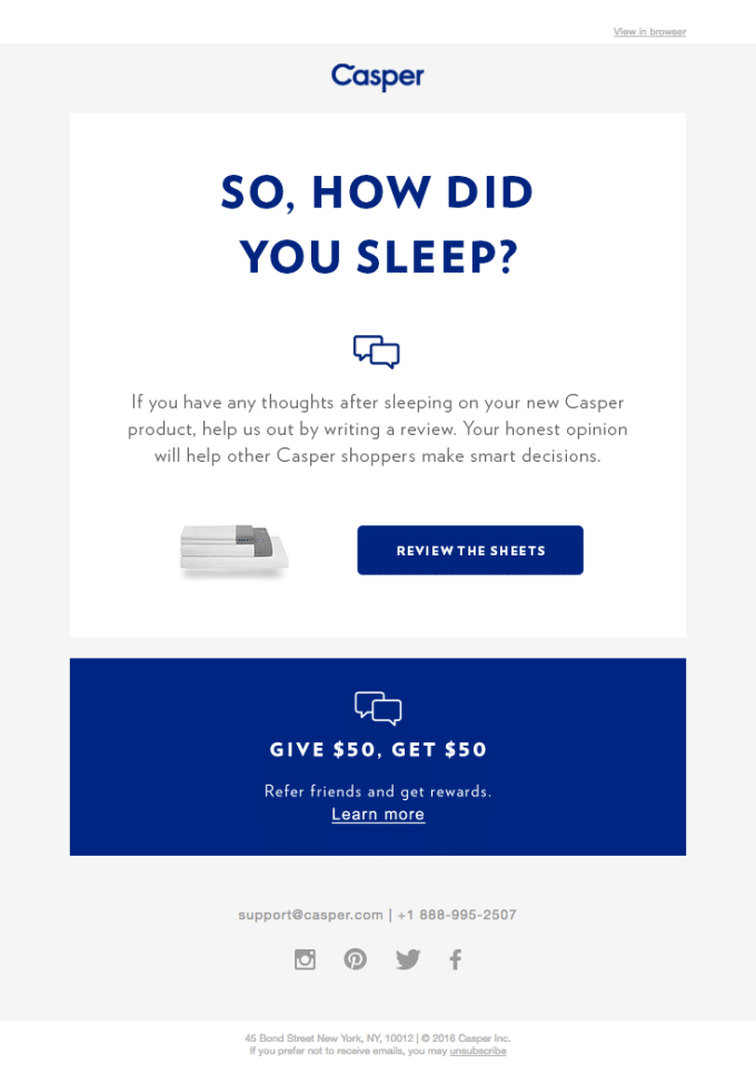
Email marketing campaigns are quite effective for gathering feedback. This particular example from Casper is our favorite, as it gets straight to the point without beating around the bush. Notice how the headline and the button use bold colors to stand out from the rest of the text. Further, don’t miss the secondary CTAs asking viewers to refer a friend for a $50 bonus.
Best Practices for an Effective CTA
Here are the best practices for designing an effective call to action:
Be Clear and Concise
Your CTA must clearly communicate the next step. Avoid ambiguous words and be as straightforward as possible. Clarity in your CTA increases conversion rates by removing guesswork from the equation. Avoid using too many CTAs to prevent users from getting distracted from the core offer.
Highlight the Value
The CTA must highlight the value readers receive by taking action. People are more likely to act if they are interested in what lies in store for them. Therefore, you can offer a discount, a free gift, exclusive content, and more to persuade readers.
Eliminate Objections
When writing your own CTAs, think of all the objections the readers might have to taking your desired action. Then write your call-to-action copy addressing those objections without going overboard. A/B testing is the most effective way to analyze what works. More on that later.
Make It Personal and Relatable
As evident from the most effective call-to-action examples, it’s best to approach the audience in the first person to increase the chances of reciprocation. Words like “me,” “you,” and “I” make your message relatable and personal, influencing readers to act.
Make It Visually Appealing
Your CTA should stand out from the rest of the message. Use bright colors, a bigger font, bold text, and persuasive content to persuade readers to take action. Remember to align the CTA buttons with your brand to remain consistent.
Maintain Hierarchy
Your email marketing campaigns can sometimes include multiple CTAs linking to landing pages, social media accounts, services pages, etc. Make sure they don’t distract the reader from the primary CTA. Your main CTA must be the biggest and boldest. Use gray-scale or matching colors for secondary CTAs.
Test and Optimize
Not all CTAs will perform equally. Unless you test and optimize the effectiveness of the message, you cannot decipher which one works best. A/B testing your CTAs will help you determine which text, color, font, and placement work best for your audience.
Common Mistakes to Avoid
Now that you know the best practices, let’s explore the most common mistakes that might restrain your email marketing campaign:
Overwhelming Your Audience

Overwhelming the audience with too much information is a guaranteed way to kill your email marketing campaign. When flooded with information, useful or otherwise, readers are fatigued, which hinders their decision-making ability. Therefore, as an email marketer, packing too much information in a single email will do you more harm than good.
In the above example, Overstock overwhelms viewers with too many offers and products in a single window. While this strategy might work for bigger brands, it is controversial and best avoided to safeguard your ROI. For best results, use no more than one primary CTA and two secondary CTAs.
Being Vague or Generic

Vague or generic CTAs don’t appeal to readers and generate confusion and disinterest. In the above example, the buttons look comical and don’t motivate readers at all. A good call to action needs to invoke desire with a tangible promise.
Using Multiple CTAs
Using way too many CTAs in email marketing is the best way to push readers away from the message. Here is an excellent example of what not to do in your next email marketing campaign.
Forgetting the CTA Button
An email without a CTA button doesn’t have a purpose and can’t influence readers to take action. In this example, readers have no clear idea of what to do next, despite having all the information.
No Actual Call to Action

A decent call to action must have a verb prompting readers to take action. In this example, the CTA button doesn’t have clear instructions for the readers.
Wrong Placement

In this case, we see a tiny text at the end of a long paragraph. This can be easily overlooked, defeating the entire purpose of a marketing email.
Boost Conversion Rates by Crafting Better Calls to Action
A call to action is crucial for email campaigns. They fulfill readers’ desires, motivating them to take action. The best ones are direct, compelling, and create urgency. In fact, a powerful call to action is essential for increasing conversion rates and growing your business.
To write effective CTAs, you should regularly A/B test the content, design, placement, and more to figure out what works best for your target audience. You can run experimental campaigns on existing customers or watch what your competitors are doing.
The best email CTAs effectively increase conversion rates. Book a discovery call today to learn how our experts can help improve your calls to action and generate greater revenue with proven strategies.
Head of Growth at Email Industries